Oil pastel techniques are one of those things that look tricky at first, but start making sense the moment you actually get your hands on them.
Think of this as advice from someone who has already made all the mistakes, figured out what works, and just wants to pass that along without any fuss.
Oil pastels are forgiving, fun, and genuinely satisfying once you understand a few basic things about how they behave.
With oil pastels for beginners in mind, covering what they are, how to use them well, which ones to buy, and what to avoid. Your oil pastel drawing starts here.
What Are Oil Pastels?
Oil pastels are one of those art supplies that don’t get nearly enough credit. They sit in a sweet spot between drawing and painting, more colorful and blendable than crayons, yet far more forgiving and accessible than traditional oil paints.
You’re picking them up for the first time or returning to them after years; they have a way of making art feel immediate and alive.
If you’ve ever handed a child a crayon and watched them go to town on a piece of paper, oil pastels give that same sense of freedom but with far more depth, richness, and creative range.
The colors are bold, the texture is satisfying, and the learning curve is gentle enough for beginners while still offering plenty of room for experienced artists to push their craft.
A Brief History of Oil Pastels as an Art Medium
Oil pastels were first developed in Japan in the early 1920s by the Sakura Crayon Company, originally designed as a mess-free, easy-to-use art tool for schoolchildren.
The goal was straightforward give young students a way to work with color that felt natural and required no special skill or setup to get started.
That changed significantly in 1949, when French art supply company Sennelier collaborated with prominent artists, including Pablo Picasso, to create a professional-grade version of the medium.
Began as a simple classroom tool and gradually earned its place in professional studios across the world, as artists pushed the medium further through layering, blending, scraping, and mixing with solvents.
Tools That Extend What You Can Do
A few affordable tools make a significant difference in what you’re able to achieve:
- Blending Stumps: for controlled, clean blending in tight areas
- Palette Knife: spreads pastel-like paint, great for building texture
- Odorless Mineral Spirits: applied with a brush, dissolve oil pastel into a wash effect
- Fixative Spray: Use between layers to reduce surface overload, not as a final coat
- Toothpicks and Styluses: for sgraffito work and adding fine detail
Oil Pastel Techniques Every Artist Should Know
They don’t require years of training or expensive classes; they just require a willingness to try things, make a few messes, and pay attention to what the medium is telling you.
The methods covered here range from the very first things a beginner should practice to more specific approaches that give you greater control over your oil pastel drawing.
Try each one separately before combining them, and you’ll start to develop a real instinct for the medium.
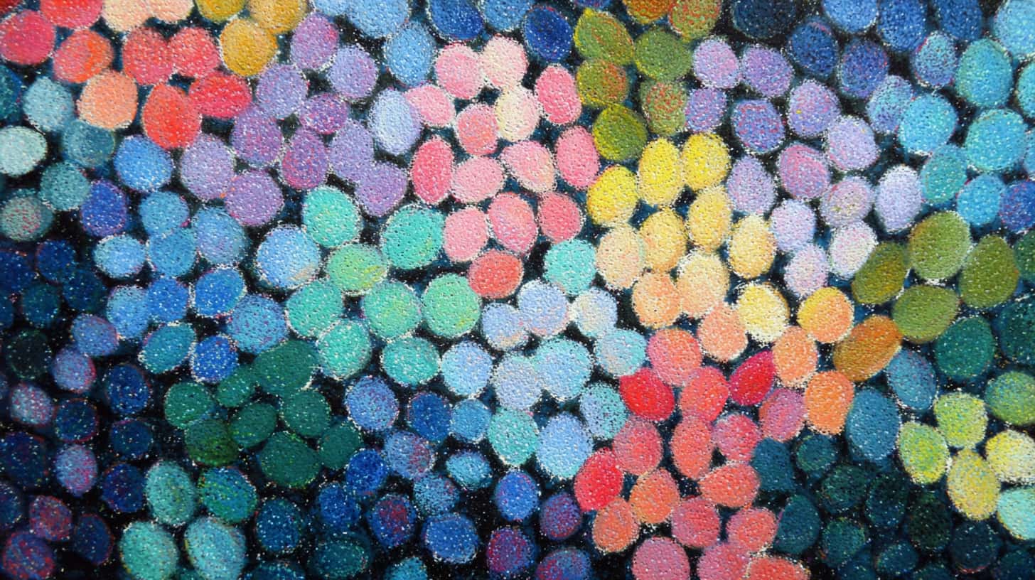
1. Layering and Color Building
Layering is the foundation of strong oil pastel work. Start light and gradually build toward darker tones.
Since oil pastels stay soft and workable, earlier layers remain active beneath new ones, allowing colors to blend and mix right on the surface.
Work with a light hand at first to avoid filling the paper’s texture too soon; once it’s full, adding more color becomes very difficult, and the surface turns muddy.
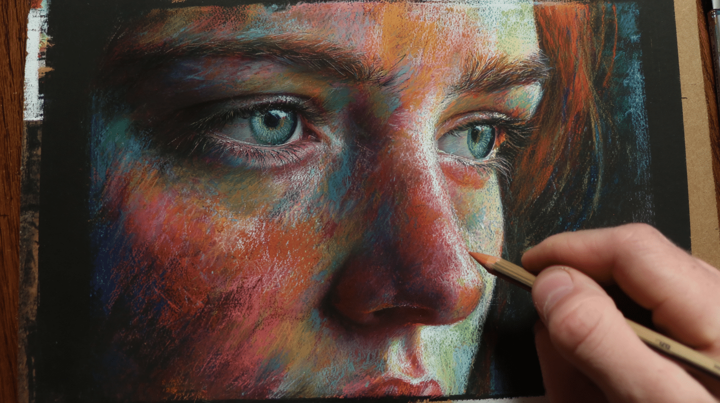
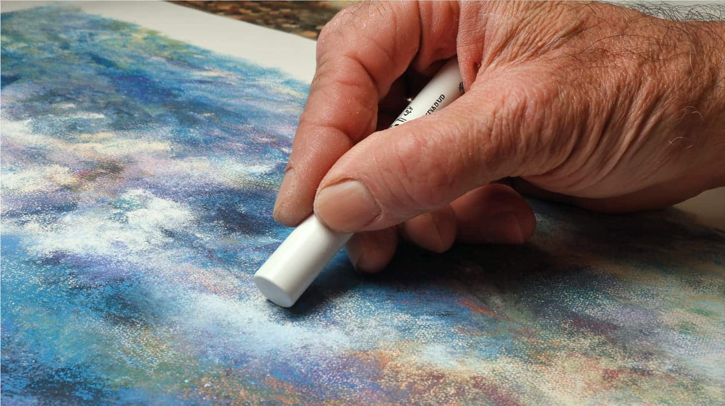
2. Blending Methods That Actually Work
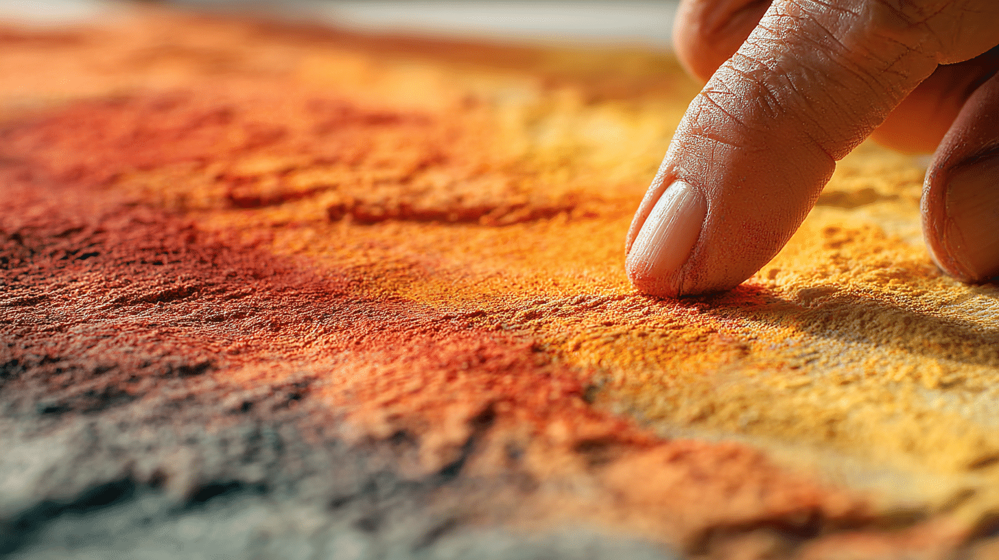
Your finger is the most reliable blending tool. Body heat softens the pastel just enough to push it around smoothly. Cotton buds give more precision in smaller areas.
Blending stumps and silicone-tipped tools work well for fine transitions. For large background areas, a soft cloth does the job quickly.
Always blend in the direction your subject naturally moves, fur, hair, fabric, so the result feels considered rather than accidental.
3. Sgraffito: Scratching for Detail and Contrast
Sgraffito means scratching through a top layer of oil pastel to reveal the color underneath. Apply a dense base layer first, then cover it with a contrasting color.
Use a toothpick, fine stylus, or the edge of a palette knife to scratch through the surface. The lines you reveal carry the color from below, creating sharp contrast and fine detail.
It works particularly well for hair, grass, fur textures, and decorative patterns in your work.
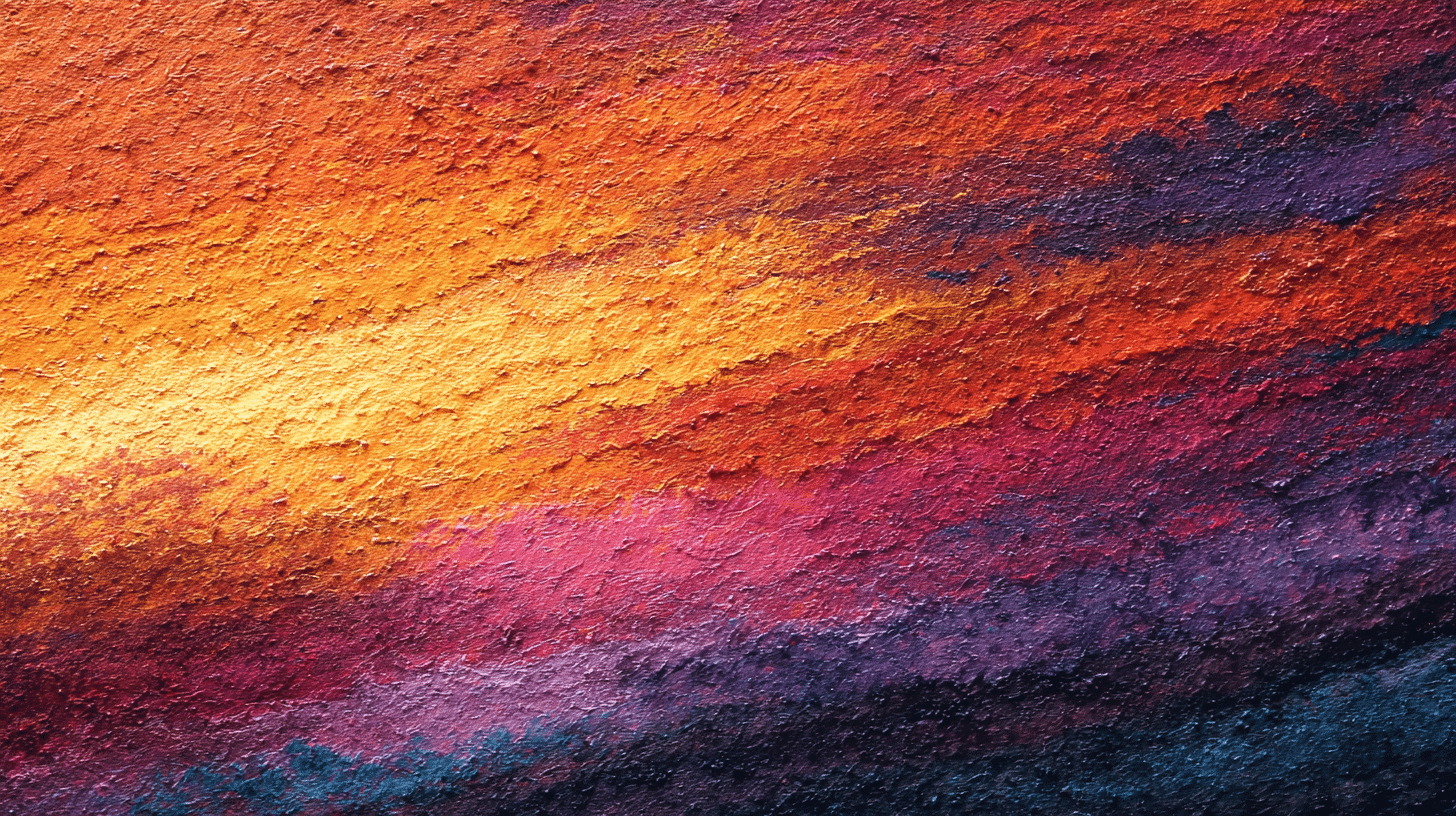
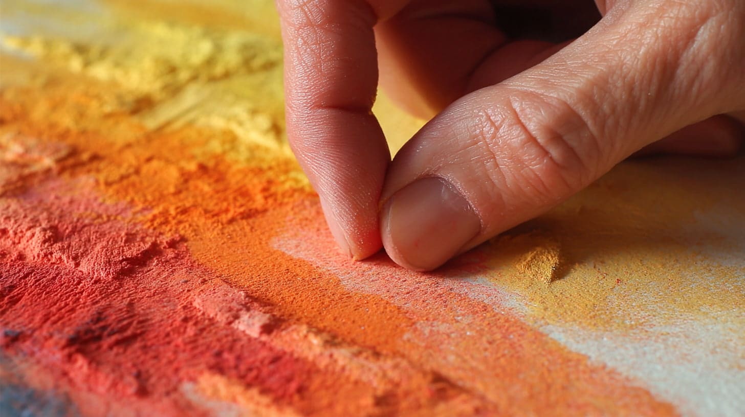
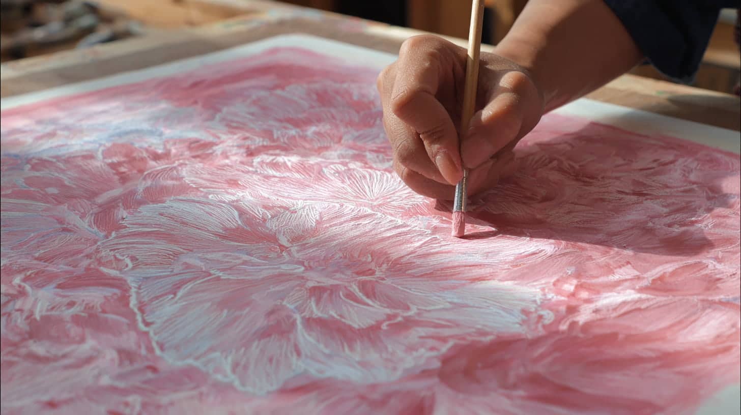
4. Impasto and Surface Texture
Impasto means pressing oil pastel on thick enough to create an actual physical texture on the surface. Push hard and build up strokes in deliberate directions to suggest rough stone, bark, or fabric.
A palette knife can spread the pastel almost like paint. This technique adds a quality that gives finished work a real material presence, something flat and smooth blending alone cannot.
5. Wet Brush Technique: Turning Pastel into Paint
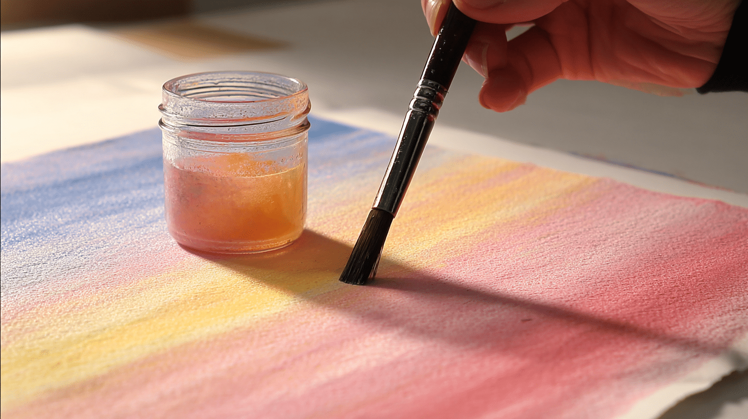
Dipping a brush in odorless mineral spirits and painting over oil pastel dissolves the pigment into a fluid wash.
This creates effects that closely resemble oil painting. It works especially well for backgrounds and large areas where you want soft, even color without visible stroke marks.
Let it dry fully before adding more layers.
6. Color Mixing Directly on the Surface
Oil pastels can be mixed right on the paper by pressing one color over another and blending them. Unlike paints, there’s no palette involved.
Start with lighter colors first, then press darker shades over them. The colors merge where they overlap, giving you in-between tones that feel natural and organic rather than mechanical.
7. Pointillism with Oil Pastels
Small, deliberate dots of inpidual colors placed close together create a sense of mixed color from a distance without physically blending them.
This works well for textured subjects like foliage, gravel, or skin. Use the tip of the pastel and keep your hand relaxed. The effect reads differently up close versus from a few steps back.
8. Resist Techniques with Oil Pastels
Because oil pastels repel water, drawing with them before applying watercolor creates a resist effect. The painted areas wash over everything except where the pastel sits.
This combination produces strong contrasts between loose, flowing color and sharp, defined marks. It’s a useful approach for botanical subjects, landscapes, and loose expressive work.
9. Negative Space Drawing
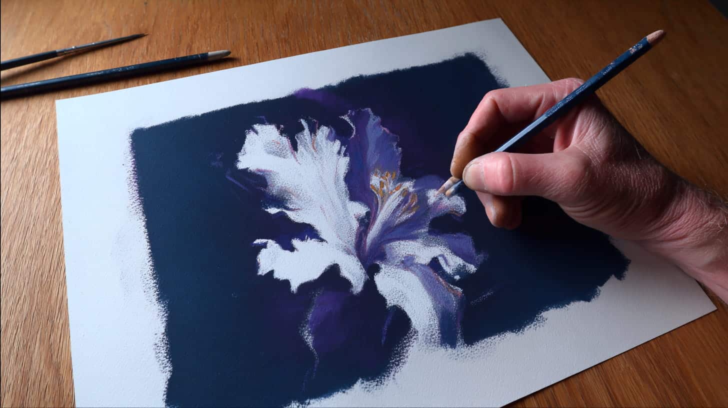
Instead of drawing your subject directly, fill in the background around it and let the untouched paper form the shape. This creates a strong contrast without overworking the subject.
It’s particularly effective for light subjects against dark grounds, white flowers, pale figures, or bright objects where the surrounding color does most of the visual heavy lifting.
10. Burnishing for a Polished Finish
Burnishing means pressing very firmly with a light-colored pastel, often white or cream, over a completed area to compress all the layers beneath it.
The result is a smooth, almost glossy surface where inpidual strokes disappear into a unified field of color. Works well for skin tones, still life objects, and any area where you want a refined, finished look.
11. Underpainting for Depth and Color Temperature
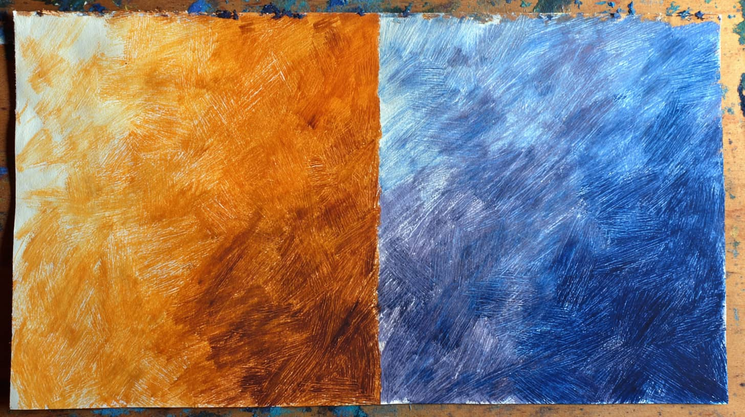
Laying down a loose base layer in a contrasting or complementary color before building your final tones adds depth that pure top-layer work can’t replicate.
A warm orange underpainting beneath blues creates a visual tension that makes the final color feel alive. This is borrowed directly from oil painting practice and translates well to oil pastels.
Best Oil Pastels for Beginners and Professionals
The difference between a low-quality and a decent set shows up immediately in how smoothly the color goes down, how well it blends, and how satisfying the whole process feels.
You don’t need to spend a lot, but buying something that works with you rather than against you saves a lot of early frustration. Here’s an honest breakdown of what’s worth your money
Recommended Oil Pastels
For anyone starting out, softness, color range, and value for money are the three things to prioritize.
| Brand | Set Size | Key Strength |
|---|---|---|
| Pentel Arts | 50 colors | Consistent softness, widely available |
| Sakura Cray-Pas Expressionist | 50 colors | Good pigment for the price |
| Faber-Castell School | 24–36 colors | Reliable for learning basic control |
| Mungyo Gallery | 48 colors | Soft texture, strong color payoff |
Mungyo Gallery stands out as the best value for beginners who want results that feel closer to professional quality without the cost.
Professional-Grade Options Worth Investing In
Professional oil pastels carry higher pigment loads and finer oil distribution, which makes a visible difference in color depth and blending range.
| Brand | Set Size | Key Strength |
|---|---|---|
| Sennelier | 24–120 colors | Industry standard, ultra-soft |
| Holbein | 225 colors | Exceptional pigment range |
| Caran d’Ache Neopastel | 96 colors | Clean, firm, highly precise |
| Jack Richeson | 12–36 colors | Artist-grade at a lower pro price |
Sennelier remains the benchmark for professional oil pastels. Originally developed alongside Pablo Picasso, they are among the softest and most richly pigmented sets you’ll find anywhere.
What Sets Oil Pastels Apart from Others
A lot of people pick up oil pastels expecting them to behave like crayons, chalk, or soft pastels they’ve already used. They don’t, and that’s actually a good thing.
Once you understand what makes oil pastels different from everything else in the art supply drawer, a lot of the confusion disappears, and the real fun begins.
The way this medium holds color, responds to blending, and builds up on a surface is entirely its own, and that’s worth understanding before you start applying your first stroke.
Mistakes Most Artists Make and How to Fix Them
The medium has specific limitations that catch people off guard, especially those coming from other drawing or painting practices.
- Overworking the Surface: Too many layers fill the paper’s tooth. Use fixative spray between applications and work in planned stages.
- Skipping the Color Plan: Oil pastels are hard to undo. Sketch lightly first and test blends on scrap paper before committing.
- Pressing Too Hard Too Soon: Heavy early pressure fills the texture too quickly. Start light, build gradually, and save firm pressure for final details.
- Ignoring Paper Choice: Glossy paper causes smearing. Work on pastel, cold-press watercolor, or sanded paper for proper grip and control.
- Blending Without Direction: Random blending looks flat. Always blend along natural contours so every stroke adds purposeful visual depth.
Small adjustments in how you approach the surface, your color choices, and your blending habits make a bigger difference than any new technique ever will.
Conclusion
This handbook has covered everything that makes oil pastels for beginners such a worthwhile starting point. They are worth every bit of time you put into learning them.
The medium is deep enough to keep experienced artists genuinely engaged for years, and every subject you take on further develops your methods.
Pick up a decent set, find a surface that grips well, and start with one technique at a time. Your oil pastel drawing practice doesn’t need to be perfect from day one. It just needs to start.
Have a question, a favorite technique, or a set you swear by? Drop it in the comments below.
Frequently Asked Questions
What Are Oil Pastels Made Of?
Oil pastels are made from pigment, non-drying oil, and a wax binder. This combination keeps them permanently soft, workable, and richly colored.
What Is the Best Surface for Oil Pastels?
Pastel paper, cold-press watercolor paper, and sanded paper all work well. Avoid glossy or coated surfaces as oil pastels won’t grip them properly.
How Do You Blend Oil Pastels Smoothly?
Your finger is the most reliable blending tool. Body heat softens the pastel just enough to push it around. Cotton buds and blending stumps work well for smaller, more precise areas.